To practice using the green screen, we have completed a training tutorial on using Final Cut Express. We used Hawa as our subject. For our first attempt we have made good use of the green screen.
We feel that this tutorial went quite well and for a first attempt at using the Chroma Key technology we think that the end result was really good. The way we lit the green screen and the subject was near perfect. We did an awesome job!!! :D
Shannon, Scott, Hawa
Tuesday, 26 October 2010

Monday, 25 October 2010
Magazine Conventions

This magazine front cover of a soap opera gives alot of conventions of itself. This cover stands out alot to soap audiences as it has the images and stories from the main soap operas people watch.
The font used is very plain. The phrase "pregnant by Ian" where "Ian" is highlighted in pink. Ian is one of the protagonist in the stories and this is why it is highlighted out. "Archie" is alos highlighted out in pink. The colours used pink, white and red are very feminine which tells us it revovles around women.
"Baby shocks" is in white. This heading is quite similar to what our soap is going to be based on. This is one of the reasons why i chose to analyse this cover.
Hawa
Sunday, 24 October 2010
Soap Magazine Cover Research

This magazine cover would be appealing to the audience as the cover is filled with information about the three most popular soaps on television.
The name of the magazine “Inside Soap” would appeal to the reader as it suggests that this magazine will contain all the latest gossip in the soaps. The strapline which reads “Every Story, Every Secret, Every Week. This would appeal to the audience as it further suggests that this magazine knows all the most recent news in the soap world about up and upcoming storylines. At the top of the page it says “First for the big soap news” which also connotates that Inside Soap knows all the biggest gossip in the soaps before any other television magazine.
The focal storyline that it is advertising is the one concerning Max, Stacey and Ryan in EastEnders. The text is in an easy to read font and the word “final” stands out against the rest of the writing making it easily noticeable to the reader and more likely that they will pick it up and have a flick through it. Stacey is placed between Max and Ryan which tells us that her choice is between them.
The other storylines in the soaps surround the focal storyline. Each of these are in a clear and easy to read font which stick out. There is use of bold colours which stand out and would attract the reader to it; just like with the main storyline they are advertising. It appears for that each soap a different style font is used which separates out all the different storylines being advertised.
For our ancillary task we will take our inspiration from this magazine, as this magazine is well loved and a lot of people like to know what is coming up in the soaps. The fonts used stand out and there is a lot going on on the cover meaning that it attracts people to it. Although on our cover we will place more emphasis on our soap and have the image for our soap a bit bigger and more centralised than on this cover; and instead of having several other soap storys being advertised we will have a couple of other soap storylines surrounding it.
On our cover we will use bold colours that stand out, very similar to Inside Soap as well as easy to read fonts.
The name of the magazine “Inside Soap” would appeal to the reader as it suggests that this magazine will contain all the latest gossip in the soaps. The strapline which reads “Every Story, Every Secret, Every Week. This would appeal to the audience as it further suggests that this magazine knows all the most recent news in the soap world about up and upcoming storylines. At the top of the page it says “First for the big soap news” which also connotates that Inside Soap knows all the biggest gossip in the soaps before any other television magazine.
The focal storyline that it is advertising is the one concerning Max, Stacey and Ryan in EastEnders. The text is in an easy to read font and the word “final” stands out against the rest of the writing making it easily noticeable to the reader and more likely that they will pick it up and have a flick through it. Stacey is placed between Max and Ryan which tells us that her choice is between them.
The other storylines in the soaps surround the focal storyline. Each of these are in a clear and easy to read font which stick out. There is use of bold colours which stand out and would attract the reader to it; just like with the main storyline they are advertising. It appears for that each soap a different style font is used which separates out all the different storylines being advertised.
For our ancillary task we will take our inspiration from this magazine, as this magazine is well loved and a lot of people like to know what is coming up in the soaps. The fonts used stand out and there is a lot going on on the cover meaning that it attracts people to it. Although on our cover we will place more emphasis on our soap and have the image for our soap a bit bigger and more centralised than on this cover; and instead of having several other soap storys being advertised we will have a couple of other soap storylines surrounding it.
On our cover we will use bold colours that stand out, very similar to Inside Soap as well as easy to read fonts.
Shannon
Poster Research

For my part of the ancillary poster research I have decided to analyse a poster of the programme called Reaper as it has a similar target audience to ours.
Analysis
Firstly there are two distinction in font style. The writing that uses a direct mode of address in the centre of the poster that says 'Are you ready?' uses a very informal and rebellious font as that is the sentence which is supposed to grab their target audience. Then the other more formal font gives basic information such as time, date and which channel the show is on. It is easy to read and keeps to the top and bottom of the poster so that it does not distract the audience from looking at the picture which advertises their programme. There is also a constant use of logos in this poster as there are two on the poster. The first is the logo for the show which is on the bottom left hand corner and the second is the channels name which is at the top. The poster's picture is very symmetrical as there is a couch that if it was not for the flames would be symmetrical. The characters sitting on the couch are equal distance from each other and both sitting in a similar way that already makes themselves slightly symmetrical as their hands are together no at different angles. Behind the two on the chair is a man in a suit that has his hands on their shoulders to the outside of the chair making it look even more symmetrical. Red is their iconic colour which is used to insinuate concepts such as danger, action, passion and excitement. Also for people that know what the television show is about the red also insinuates hell as the show is about working for the devil, this meaning is anchored down with the flames coming out of the couch. Clothing worn by the characters are geared towards their target audience as the two sitting on the couch are wearing clothes such as jeans, shirts and jackets which allows their target audience to identify with them. Binary opposites are used behind these two as the man behind them representing the devil is wearing a formal suit which represents things such as authority which labels him out as the enemy. All the characters are looking at you the audience so that they make a connection with the person looking at the poster (The character on the right hand side of the couch is peeking at you at the side of his eyes). Lastly there is use of facial expressions to help convey their situation as the two people sitting on the couch have pained expressions on their faces and the devil behind them is smirking as if he knows something they do not.
Points of Interest
- Use basic fonts for information such as date, time and which channel the programme will be on.
- Use a sentence that will grab the audience (E.g. Are you ready?).
- Use logos (Yours and the channel it is showing on).
- Use symmetry (Not perfect symmetry though).
- Make sure you have an iconic colour.
- Make the characters look at YOU.
- Make sure the clothing fits in with our target audience.
- Try and have facial expressions.
Scott
Saturday, 23 October 2010
Analysing The Talk Show Genre
As mentioned before we have decided to do a talk show based them for our Soap Opera trailer. For this I have decided to do some extra research about the talk show genre fro shows such as ;The Jeremy Kyle Show' and 'The Jerry Springer Show'. I have analysed two clips each for these shows and have seen clear distinctions between the two. One main reason for this I think is that The Jerry Springer Show is American which like to have over dramatic themes in their shows and The Jeremy Kyle Show is British which like their shows calmer and more realistic.
The Jerry Springer Show
1) Shows opening sequence:
2) Clip of The Jerry Springer Show:
Starting from from clip one which is the opening sequence there is already an establishment of brand identity by having a warning at the beginning telling the audience that their show is for adults only. The word 'warning' is in a thick bold red which is used to put emphasis on the danger element of the show. After this we are greeted by what appears to be a trailer which is not normally shown on the beginning of The Jerry Springer Show, nut this is an exception as it is the first episode of the new nineteenth season. This part is in a comercial format which will be able to give us a good impression on what we may want our Soap Opera trailer to be like. The narrator explains a few of the stories such as two people wanting to marry the same women. this clip mainly contains all the most dramatic scenes such as a man rising up with his arms in the air and this clip also gives off their brand identity as having over exaggerated violence with people jumping on each other, beating each other with flowers and censoring out random parts of the body to incinuate that a person is being inapropriate (e.g. Censoring out chest to incinuate that their nipples have become exposed although this may not be the case).
After this commercial like sequence there is a pan long shot on the audience to create their prescence which then goes onto Jerry's overdramatic entrance by entering from the roof. The audience being an establishing shot is also used in The Jeremy Kyle Show as I will compare when I have analysed both of the shows. Jerry will then explain what their topic is for today. The non-diegetic background music has a rock theme to it to give the show a feeling of intensity to yet again make the show even more dramatic.
Analysing the second clip of The Jerry Springer Show there are two motifs emphasized here, one is violence as the characters can not seem to stop themselves from jumping on each other in an almost drunken rage. The second is the emphasis on controversy. In this clip a grandmother is having a sexual relationship with her grandson. These two factors work together to yet again make their show over dramatic. On the bottom of the screen there is the Jerry Springer logo which adds to brand identity along with a brief synopsis of what the issue is so that late watch can know what is happening. There is a definate relationship between colour and brand identity as background is always a brick red which represents danger. Using a brick background and from clip one there is a brand identity that the show is similar to that of a night club as there are flashing lights coming from the roof and the walls are brick colours giving off a vibe of excitement. In this show the bouncers have a large presence as they always try to stop the violence which in most cases end up making the issue worse, but they are also there to stop the entire show to be about fighting and will leave room for talking which will lead to more violence.Another factor in the show is that the audience do not make hissing noises or are used for comedic sound effects for drama like in The Jeremy Kyle Show but are used to build drama in a different fashion, instead of sound effects they will chant Jerrys name whilts standing up and will also give insults such as 'Freak'. Along with this Jerry also insults their guests and in most shots he is shown with the audience behind him.
The Jeremy Kyle Show
1) Shows opening sequence:
1) Clip of The Jeremy Kyle Show:
In clip one which is an example of the Jeremy Kyle opening sequence. The iconic colour of The Jeremy Kyle Show is blue which is associated with calmness which their show is trying to convey. Proof of this is shown in the sequence. It starts with small scenes of the host Jeremy Kyles face talking and other small pictures of normal people doing their ordinary activities. The non-diegetic background music is jazzy to give the audience a feeling of intelligence to the show. At the end of this sequence we see their logo which is their icon telling informing the audience that they are watching The Jeremy Kyle Show. After this the camera is set on the audience clapping with a panning mid body shots of the audience and then being greeted by Jeremy Kyle and he thanks them for his applause and welcomes the audience/viewers to the show. To convey the situation large white writing appears on the screen informing the audience of the situation.
Clip two is an example of the actual talking part of the show. Again there is the iconic calming blue background of the set. In this show there is a lot of talking and no physical violence, there are the presence of bouncers but they are not seen unless actual violence did break out. Jeremy Kyles talking is very sharp and harsh which is used to bring the interest and drama into the show. By using insults and provoking the guests Jeremy Kyle manages to bring interest rather than actually trying to talk to his guest calmly which would be considered boring on television. Another way drama is brought to The Jeremy Kyle Show is by using the audience. The audience in this show is mainly used for two things, the first being used to add amusing gasps like 'ooh' and 'ahh' which makes can be used to spur on any intense conversations or create intense conversations. The second is to put them behind Jeremy Kyle giving the impression that the entire audience is on his side which makes him seem more powerful. The last way The Jeremy Kyle Show creates drama and interest into his show is by inviting scummy and controversial guests in which he can insult. In clip 2 there is an unemployed teenager who has gotten his girlfriend pregnant whilst he has cheated on her fifteen times and has no interest in finding a job so he drinks 20 cans of beer a day. This is very controversial as their target audience in mainly social class C2, D and E which have more of a taste for tabloid newspapers which usually tend to highlight these topics. Lastly on the bottom left hand corner there is the Jeremy Kyle logo accompanied by a quick synopsis of the situation.
Comparing the Two Shows
Comparing these two shows we can see both similarities and differences between the two. Starting with differences, although they are both talk shows the entire feel of their shows that they represent to their audiences are completely different. Jerry springer focus' more on violence where as Jeremy Kyle focus' more on talking. Jerry Springer conveys the more physical intensity of his show by using a brick background and the constant presence of bouncers to hold their guests back whilst provoking them where as Jeremy Kyle uses blue to create a calm environment to try and verbally bash his guest into submission without using bouncers. Their non-diegetic background music are both different as Jerry Springer has a more rock beat and the Jeremy Kyle uses a Jazzy melody to try and create the mood. In Jerry Springer the audience are used to cheer, hiss and boo where as Jeremy Kyle makes the audience give sound effects to create his mood. Another way they both use their audience in a different way is by using the opening sequence. In Jerry Springer he comes down on a pole and near jumps into the audience using a panning long shot shaking their hands while they are chanting his name where as Jeremy Kyle gets his audience to calmly clap as panning mid shot shows them and Jeremy Kyle will simple accept their applause graciously. The last difference is that Jerry Springer has a big flashy warning message at before the show begins and Jeremy Kyle does not.
As many differences as there are between the shows there are also similarities. One similarity is that they both have their logos followed by a brief explanation at the bottom left hand side of the screen. Another similarity is that they both have their audience in the background of their shots as to convey that the audience is on their side. Scummy guests also seem to be used in both shows although Jerry Springer tends to be more controversial using themes like incest instead of topics like teenage pregnancy in the Jeremy Kyle show. The host also jabs at their guests psychologically as well although Jeremy Kyle does this more as his show is more about talking than violence unlike Jerry Springer.
Scott
The Jerry Springer Show
1) Shows opening sequence:
2) Clip of The Jerry Springer Show:
Starting from from clip one which is the opening sequence there is already an establishment of brand identity by having a warning at the beginning telling the audience that their show is for adults only. The word 'warning' is in a thick bold red which is used to put emphasis on the danger element of the show. After this we are greeted by what appears to be a trailer which is not normally shown on the beginning of The Jerry Springer Show, nut this is an exception as it is the first episode of the new nineteenth season. This part is in a comercial format which will be able to give us a good impression on what we may want our Soap Opera trailer to be like. The narrator explains a few of the stories such as two people wanting to marry the same women. this clip mainly contains all the most dramatic scenes such as a man rising up with his arms in the air and this clip also gives off their brand identity as having over exaggerated violence with people jumping on each other, beating each other with flowers and censoring out random parts of the body to incinuate that a person is being inapropriate (e.g. Censoring out chest to incinuate that their nipples have become exposed although this may not be the case).
After this commercial like sequence there is a pan long shot on the audience to create their prescence which then goes onto Jerry's overdramatic entrance by entering from the roof. The audience being an establishing shot is also used in The Jeremy Kyle Show as I will compare when I have analysed both of the shows. Jerry will then explain what their topic is for today. The non-diegetic background music has a rock theme to it to give the show a feeling of intensity to yet again make the show even more dramatic.
Analysing the second clip of The Jerry Springer Show there are two motifs emphasized here, one is violence as the characters can not seem to stop themselves from jumping on each other in an almost drunken rage. The second is the emphasis on controversy. In this clip a grandmother is having a sexual relationship with her grandson. These two factors work together to yet again make their show over dramatic. On the bottom of the screen there is the Jerry Springer logo which adds to brand identity along with a brief synopsis of what the issue is so that late watch can know what is happening. There is a definate relationship between colour and brand identity as background is always a brick red which represents danger. Using a brick background and from clip one there is a brand identity that the show is similar to that of a night club as there are flashing lights coming from the roof and the walls are brick colours giving off a vibe of excitement. In this show the bouncers have a large presence as they always try to stop the violence which in most cases end up making the issue worse, but they are also there to stop the entire show to be about fighting and will leave room for talking which will lead to more violence.Another factor in the show is that the audience do not make hissing noises or are used for comedic sound effects for drama like in The Jeremy Kyle Show but are used to build drama in a different fashion, instead of sound effects they will chant Jerrys name whilts standing up and will also give insults such as 'Freak'. Along with this Jerry also insults their guests and in most shots he is shown with the audience behind him.
The Jeremy Kyle Show
1) Shows opening sequence:
1) Clip of The Jeremy Kyle Show:
In clip one which is an example of the Jeremy Kyle opening sequence. The iconic colour of The Jeremy Kyle Show is blue which is associated with calmness which their show is trying to convey. Proof of this is shown in the sequence. It starts with small scenes of the host Jeremy Kyles face talking and other small pictures of normal people doing their ordinary activities. The non-diegetic background music is jazzy to give the audience a feeling of intelligence to the show. At the end of this sequence we see their logo which is their icon telling informing the audience that they are watching The Jeremy Kyle Show. After this the camera is set on the audience clapping with a panning mid body shots of the audience and then being greeted by Jeremy Kyle and he thanks them for his applause and welcomes the audience/viewers to the show. To convey the situation large white writing appears on the screen informing the audience of the situation.
Clip two is an example of the actual talking part of the show. Again there is the iconic calming blue background of the set. In this show there is a lot of talking and no physical violence, there are the presence of bouncers but they are not seen unless actual violence did break out. Jeremy Kyles talking is very sharp and harsh which is used to bring the interest and drama into the show. By using insults and provoking the guests Jeremy Kyle manages to bring interest rather than actually trying to talk to his guest calmly which would be considered boring on television. Another way drama is brought to The Jeremy Kyle Show is by using the audience. The audience in this show is mainly used for two things, the first being used to add amusing gasps like 'ooh' and 'ahh' which makes can be used to spur on any intense conversations or create intense conversations. The second is to put them behind Jeremy Kyle giving the impression that the entire audience is on his side which makes him seem more powerful. The last way The Jeremy Kyle Show creates drama and interest into his show is by inviting scummy and controversial guests in which he can insult. In clip 2 there is an unemployed teenager who has gotten his girlfriend pregnant whilst he has cheated on her fifteen times and has no interest in finding a job so he drinks 20 cans of beer a day. This is very controversial as their target audience in mainly social class C2, D and E which have more of a taste for tabloid newspapers which usually tend to highlight these topics. Lastly on the bottom left hand corner there is the Jeremy Kyle logo accompanied by a quick synopsis of the situation.
Comparing the Two Shows
Comparing these two shows we can see both similarities and differences between the two. Starting with differences, although they are both talk shows the entire feel of their shows that they represent to their audiences are completely different. Jerry springer focus' more on violence where as Jeremy Kyle focus' more on talking. Jerry Springer conveys the more physical intensity of his show by using a brick background and the constant presence of bouncers to hold their guests back whilst provoking them where as Jeremy Kyle uses blue to create a calm environment to try and verbally bash his guest into submission without using bouncers. Their non-diegetic background music are both different as Jerry Springer has a more rock beat and the Jeremy Kyle uses a Jazzy melody to try and create the mood. In Jerry Springer the audience are used to cheer, hiss and boo where as Jeremy Kyle makes the audience give sound effects to create his mood. Another way they both use their audience in a different way is by using the opening sequence. In Jerry Springer he comes down on a pole and near jumps into the audience using a panning long shot shaking their hands while they are chanting his name where as Jeremy Kyle gets his audience to calmly clap as panning mid shot shows them and Jeremy Kyle will simple accept their applause graciously. The last difference is that Jerry Springer has a big flashy warning message at before the show begins and Jeremy Kyle does not.
As many differences as there are between the shows there are also similarities. One similarity is that they both have their logos followed by a brief explanation at the bottom left hand side of the screen. Another similarity is that they both have their audience in the background of their shots as to convey that the audience is on their side. Scummy guests also seem to be used in both shows although Jerry Springer tends to be more controversial using themes like incest instead of topics like teenage pregnancy in the Jeremy Kyle show. The host also jabs at their guests psychologically as well although Jeremy Kyle does this more as his show is more about talking than violence unlike Jerry Springer.
Scott
Friday, 22 October 2010
Branding
Branding
A brand is not the same as a product. In terms of coursework the product is a soap opera however the brand would be EastEnders, Emmerdale, Coronation Street or Neighbours which are all different soaps and each have their own separate image. Neither of these soaps have a similar brand identity.
Branding is an essential part of promoting a specific product. There is a need for different brands came about as a result of mass production. Nomi Klein, No logo said "….Competitive branding became a necessity of the machine age-within a context of manufactured sameness, image-based difference had to be manufactured along with the product."
Branding is all about creating an image that people can easily link to a certain product that will draw in consumers over and over again. In terms of soap operas this would be people linking the theme tune and setting to the soap.
According to mudvalley.com here are 8 elements that come together and create a brand identity.
- Brand Essence - What a brand means in a sentence.
- Brand Slogan - Often a catchphrase linked to the logo.
- Brand Personality - What kind of character does the brand have? These humanise the brand and make it easier to relate to.
- Brand Values - What does the brand stand for/against?
- Brand Appearances - What does the brand look/sound like?
- Brand Heritage - What tradition does it have?
- Emotional Benefits - What feelings does it offer the consumer?
- Hard benefits - Is it cheaper/better? What real benefits does the brand offer to the buyer?
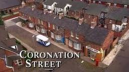 The brand identity of Coronation Street is quite clear through the way it shows terraced houses, the corner shop and the pub. You can tell at a glance that the soap will be about family life and focus primarily on the working class. The theme tune also suggests working class and it is played by a brass band which tells us that it is set in the North of England. All of this suggests that the soap would be aimed at an older audience as it deals with every day real life family issues.
The brand identity of Emmerdale instantly gets across the message that it is all about village life due to the mise en scene showing plenty of greenery. It is clear to the audience that Emmerdale is set in a rural area through the landrover that is being driven, which is generally used on farms, in the mise en scene. The stone buildings are also connotate that it is set in a rural area. Since Emmerdale is set in a rural area everyone in the village will know each other and what is going on in each other’s lives as they are a tight knit community.

The brand identity of EastEnders is very simplistic. It shows a bird’s eye view of the East End of London which connotates city life and the working class. It is well known that London is known for a high crime rate in some areas so another connotation of the logo is that there will be crime present to a certain degree but not to the extent of central London.
 The brand identity of Hollyoaks is that it is youthful. The logo connotates that it is for both girls and boys through the use of the signs used to represent each gender and how half of Hollyoaks is written in pink (which connotates femininity) and the other half is written in blue (which connotes masculinity).
We want our brand identity to be similar to that of Hollyoaks as we are aiming it towards a similar target audience. Our trailer is going to be fun and youthful as we are taking our inspiration from Jeremy Kyle and Jerry Springer which are especially popular with the younger generation. Hollyoaks also tackle controversial issues and in our trailer we are tackling the issues of homosexuality and teenage pregnancy. At the moment Emmerdale is tackling homosexuality with the stoyline concering Aaron and Jackson; Hollyoaks is also tackling homosexuality with the storyline concerning Ste and Brendan; Coronation Street is tackling homosexuality with the storyline concerning Sian and Sophie; and EastEnders is tackling the issue of homosexuality with the storyline of Syed and Christian (made controverial because Syed is a muslim). It is for this reason, that it is current and popular, that we began to consider homosexuality as our main storyline.
Shannon
Target Audience Questionnaire
To find our target audience I have produced a questionnaire to find out what people like and then exploit this information in our Soap Opera trailer. This is what my questionnaire looked like:

I then printed out 50 copies of this questionnaire and asked 10 members of each age group stated and within those age group 5 were male and 5 were female. I then personally distributed and compiled the data into an Excel document and made a visual representation for each of the quantitative data questions I asked.
Here is the Excel document I made in which I then turned into .jpg files by using Macromedia Fireworks:


+What+is+you+age.jpg)
+What+gender+are+you.jpg)
+What+issue+would+you+like+to+see+in+a+soap+opera.jpg)
+Which+soap+opera+do+you+watch.jpg)
+Did+they+tackle+this+well.jpg)
+What+setting+would+you+like+to+see+in+a+new+soap+opera.jpg)
In question 5 there are more than 50 answers in it because most people actually watch more than one soap at the same time. This is a great finding because it tells us that people watch a variety of different soaps and not just one. This allows us to be able to make a space in the market that will be watched as we now know that people do not only stick to one soap opera.
For question 3 since it is a qualitative answer I will give an explanation to what most people have wrote in their questionnaire. Socio-economically speaking most people that answered the questionnaire we in the D, C1 and C2 scale area. The small minority were B and A. Also no one in the E section had admitted to watching soap operas.
Also for question 6 since it is a qualitative answer I will give another explanation to what most people have wrote in their questionnaire. In Emmerdale most people were interested in a man that has just recently confessed to being gay and has gotten into an accident with his first boyfriend. In neighbours people were interested in another male character admitting to being gay and then breaking up with his girlfriend.
The results of my questionnaire have shown that people between the early twenties and mid thirties as there seems to be a gap in the market for this age range according to my questionnaire as the most popularly watched soaps are Coronation Street and EastEnders which are mainly aimed at an older audience.
Scott
Subscribe to:
Posts (Atom)